Using Plot.ly to Make Confidence Intervals

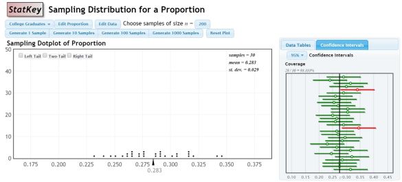
Last year, I introduced confidence intervals using an applet. There are lots of them out there, but this is my favorite. I like that it simultaneously shows the proportions on a dot plot and constructs the confidence intervals off to the side for each sample.

Capture

My problem with introducing it this way is that I’m concerned that since the data is pre-loaded, and not something familiar to the students, it’s hard to connect to.

I wanted to essentially create the same experience, but let it be with data the students collected. I wasn’t aware of a program that would let me input the information for the sample proportion then also graph the lines for the confidence interval as well. Then I remembered seeing a function in Plot.ly called error bars!

My Plan:

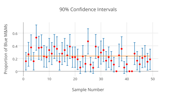
Recently, my students took data on proportions of M&Ms in fun size bags of M&Ms, letting each one be a “sample” of all M&Ms. I am going to print out sets of 3 samples on individual slips, and redistribute them to students, so that once again, all students have different data to work with. They will calculate 95% and 90% confidence intervals for each sample, and then will send me the proportion and their margin of error through a Google Form. I will use plot.ly to create one graph of the 95% intervals and another of the 90% intervals, so that we can compare and contrast, and look for those that “miss” the true proportion.

The Nitty-Gritty-Plot.ly-Magic:

  1. Open up the Plot.ly Workspace
  2. Since I’ll have each student calculating 2 versions of the CI for each of their 3 samples, I’m using a google form on which they will enter their sample number (on the sheet I’m giving them), the proportion of Blue M&Ms in their sample, and the margin of error for the 90% CI and the margin of error for the 95% CI.
  3. Use the Make a Plot button at the top to choose scatterplot. In the left menu, select Error Bars.
  4. Copy the data from the google form responses into the plot.ly spreadsheet. You will have to relabel the columns in plot.ly if you just copy and paste. I also create a column that contains 0.24 over and over again, since this is the true proportion of blue M&Ms advertised by the company.
  5. I plan to make my intervals, so I will have the Sample number as the x, the proportion as the y, and the margin of error for one of the CI’s be the Ey (error in the y direction).
  6. Scroll to the bottom of the left menu and select the blue Scatter Plot button.
  7. To add a horizontal line that represents the true proportion, I went back to the grid tab, then used the Make a Plot button to select Line Plot. I turned off the variable choices in the columns, and then chose Sample number as x and the true proportion column as y. At the bottom of the left hand menu, use the Insert Into dropdown to select the graph tab 2. Then hit Line plot for it to be added to that same graph.

Here’s my practice run:

9025_confidence_intervals

I think we may get another snow day tomorrow. If so, I may do a screen recording video. (Now I’m thinking that would have taken less time if I had just done that in the first place…)
Unit Circle – Paper Triangles

I’m sure someone else had this idea long before me, but I didn’t consciously take it from anyone in particular. This year, I wanted to help my Pre-calculus students understand the patterns inherent in the unit circle. First I used this idea from Kate and Riley.

Since this activity didn’t make it clear how to get the radical forms of the key values for sin and cos, I wanted another activity to make those patterns evident. We spent a day reviewing special right triangles, and then the next day, I gave them this blank copy of the unit circle, having them fill in the degree measures first. Then I gave them quarter sheets of orange copy paper.

I gave these directions:

  1. Line one edge of the orange paper up to sit on top of the x axis.
  2. Align the right edge of the paper with the point is formed by the radius in in the 30 degree angle.
  3. Trace the radius (through the paper) in order to make your triangle.
  4. Turn the orange paper 180 degrees to get another corner (to save paper!)
  5. Repeat steps 1-3, but using the radius from the 45 degree angle.
  6. Cut out both triangles.

After that, we labeled the angles, and they were able to tell me that the hypotenuse was 1 unit because of earlier discussions on unit circle. We derived together the lengths of the missing sides through the formulas related to special right triangles to label the sides of the triangles. Have them label both sides of the orange triangles, so they can flip them and still read the measurements in other quadrants.

To get them started, we went to quadrant one and placed the 30-60-90 triangle in place. This helps them visualize the x-coordinate and y-coordinate of 30 degrees. I took them through the first quadrant and up to 120 degrees. In each class, someone was able to predict the coordinate sign changes that the x-coordinates are negative. At that point I left them to the task of completing the unit circle. I also gave them this handout to help them process through the patterns that they found. Here are some pics for the visual folks out there.

2015-01-13 07.09.00

2015-01-13 07.09.11

2015-01-13 07.09.24

2015-01-13 07.09.35


Grading growth

I teach a class that was created as an intervention class for students with low ACT scores. Our school has recently become part of a blended learning pilot program, meaning that I have a class set of laptops now. In discussion with my principal, we have decided to make this class much more individualized, since one of the difficulties in managing that class is the huge gap between the highest and the lowest students. I am giving them a diagnostic ACT test and trying to figure out then where each of them should start their remediation. In order to run the class this way, we have to figure out a fair way to grade them based on their growth and effort. I’m thinking a rubric may be the fairest way to do this, but am stuck on what my categories/indicators would be. Got any ideas or even guiding questions for me?

Graph descriptions

I haven’t posted in forever, and honestly probably won’t make time for deep thoughtful posts again this year, but I’m thinking about trying a new math routine for my students. One of the classes I teach is called Bridge Math, which is supposed to take students who have not done well on the ACT and have them improve their scores by re-learning the key tested concepts from Alg. 1, 2, and Geometry.

I decided to use the warm-up time in class to create some math routines. We utilized Estimation180.com to work on number sense. I liked that it gave them an easy way to get involved early without the stress of having the correct answer.

Many of my students have trouble with graphs. I’ve noticed these particular struggles a lot:

  • Trouble thinking about both the x and y values of particular points
  • Misplaced 0 in the ordered pair for a point on either the x or y axis
  • Miscounting when counting horizontal or vertical distances
  • Counting boxes to measure a distance along a diagonal line

At the beginning, I plan to start with only points on a grid, but I want to build up to linear functions, quadratic functions, scatter plots, etc. and will try to post pics of the graphs I use. At least to start, I plan on asking “What do you notice?” and “What do you wonder?” I think this will give me chances to get all students involved, create some debate, and address some vocabulary along the way.

Find all the graphs I’ve made so far here.